Visualize Markers
This tutorial shows how to visualize selected markers with the scmags package.
First, the markers need to be selected. Let’s start with the marker selection process.
[1]:
import scmags as mg
baron_h1 = mg.datasets.baron_h1()
baron_h1.filter_genes()
baron_h1.sel_clust_marker()
-> Eliminating low expression genes
-> Selecting cluster-specific candidate marker genes
-> Selecting  markers for each cluster
After making a marker selection, you can visualize markers in 3 ways. You can also perform k-NN classification with selected markers and visualize the normalized confusion matrix.
Let’s start with the heatmap
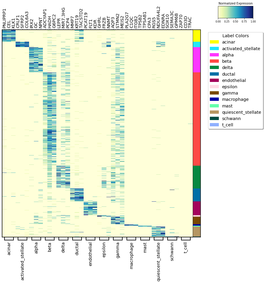
Heatmap
In this heatmap, the selected markers for each cluster are visualized sequentially.
On the right, the cluster labels are colored so that it can be seen how distinctive the markers are.
[2]:
baron_h1.markers_heatmap()
t-SNE
The t-SNE plot shown below is plotted as a result of the t-SNE calculated from the selected markers. If the selected markers are dissociative, their clusters are expected to be differentiated in the t-SNE plot.
[3]:
baron_h1.markers_tSNE()

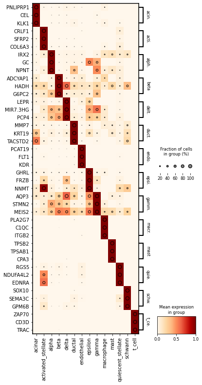
Dotplot
It was prepared using the dotplot scanpy library.
In dotplot, on the other hand, it is desired that the markers selected for the cluster are in dark color within the cluster, which means that the expression within the cluster has a high mean. In addition, the drawn rings should still be larger within the cluster, with larger rings representing higher expression.
[4]:
baron_h1.dot_plot(largest_dot=50)
Confusion Matrix
Here, we first perform k-NN clustering and visualize the results with a normalized confusion matrix.
[5]:
baron_h1.knn_classifier()
